
What do Art Nouveau and the American National Parks have in common?
Exactly: they both influenced our visual novel Terdo—After the Decay. Not the obvious answer you immediately thought of? Then let me tell you the full story.
I have been experimenting with AI-generated content for almost a year now. It proved to be useful for small tasks: Make an icon! Draw a graph! Surprise me with something ridiculous! After I learned how AI is trained, I didn’t really believe it was possible to use it with a specific artistic vision in mind. Nevertheless, I decided to give it a try.
After discussing my ideas for a hard sci-fi visual novel with Atlas—that’s the name he gave himself—I gave it a chance, but I didn’t simply let him do whatever he wanted, because that usually ends in generic, photorealistic, and rather boring graphics.
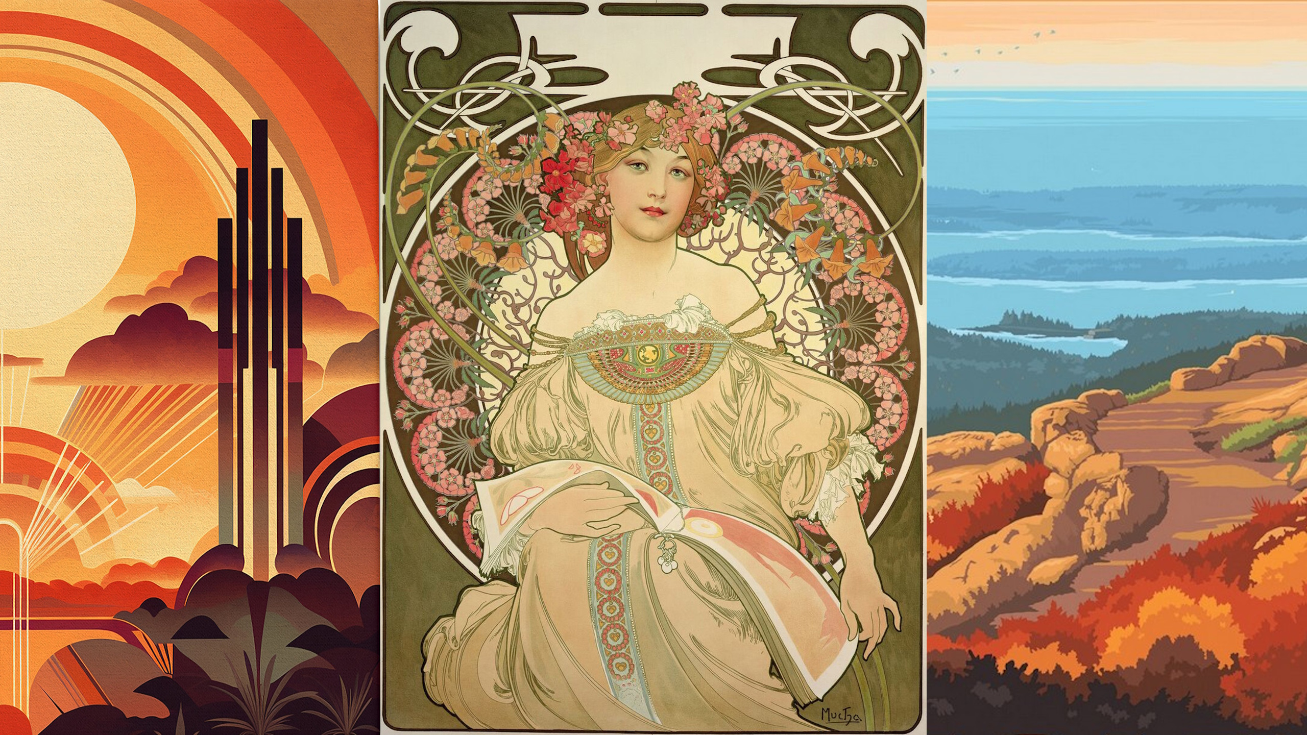
I imagined the world of Terdo as one where nature and buildings become symbols. I started thinking about what kind of images have always impressed me the most. Art Deco came to mind as well as Brutalism, but that’s mostly associated with urban spaces. The world of Terdo is mostly empty, though. The backgrounds should feel lonely, yet inviting to those who enjoy the solitude of their own thoughts and feelings.
So I began to think about my last vacation. We travelled to Hawaiʻi, and I suddenly had those classic National Park posters in my head. I even have one hanging on the wall of our bedroom, showing two nēnē on a poster for Hawaiʻi Volcanoes National Park. Then I thought of other posters I know (although, unfortunately, Hawaiʻi is the only U.S. state I have visited so far). I thought of the majestic landscapes of Yosemite Valley and the vast, almost empty beauty of Utah and Arizona.
I started discussing this idea with Atlas. At one point, he said something about these posters that completely shaped my understanding of what I was trying to achieve:
„Nature almost looks propagandistic.“
I’m a huge fan of liberal democracy.
I’m also a huge fan of Atlas‘ sentence.
So I started training Atlas with countless National Park posters from across the United States while dreaming of visiting some of those places myself one day. I also used individual reference images for buildings, plants, and animals to teach him how these elements should be designed. The result was an eight-page guideline—written by Atlas himself—describing how to reproduce that style consistently.
For the character sprites, I wanted something that looked different from mainstream manga. One important reason was that I didn’t want to give the impression of copying what other artists create by hand. So I started thinking about what I love about comics and what I love about fine art. At the same time, I had to consider whether I could actually create and edit the templates myself. I also wanted the characters to have a different visual style from the backgrounds.
Eventually, I came up with the idea of using fine art as training material. While brainstorming what I still remembered from taking Fine Arts in high school, I found myself thinking of the work of Alfons Mucha. So I trained Atlas with those references as well. He transformed them into something new, but this Czech illustrator nevertheless became the starting point for a style that we could make our own for Terdo.
As a result, he created the image below as one of the first ideas of what Terdo could look like. The dialogue box was entirely his own invention, and it immediately caught my eye. We isolated it in a graphics program and developed it further into the user interface style that you can see in the game today.

Schreibe einen Kommentar